Monday, 26 November 2012

Working On Student Magazine


This is a screenshot from my first time using 'In Design'. Today I have learnt the basics, such as adding text, images and adding some effects to the text. I used a 'Satin' effect to the text on the masthead to make it look more interesting. I also fitted the background cover image to the page. I also added an image of the South Downs logo, and removed the white background. Next week I plan to add more cover lines and make the magazine cover look more interesting.

Monday, 19 November 2012

Comparison of Camera Techniques


Comparison of Camera Techniques


 The two magazines have different genres and audiences, therefore the covers are different to appeal to different people. For example, the focal point for 'The Source' magazine is the shut eyes. The main image is in the centre drawing attention. The colour scheme is also red, with block and bold writing which also draws attention. The magazine is aimed at men, so the cover has a 'grunge' type theme to it so it would appeal.

The magazine for Vanity Fair has a grey, black and silvery colour theme to it. This is to make the magazine look sophisticated and interesting, it also goes with Lady Gaga's pale skin tone. The angle that Lady Gaga is sitting at is upright with her arm and leg crossed over. This makes a sharp triangle shape, to try and make her look seductive and appealing to the audience. This also draws attention to her hair and face which is the main focus of the cover. As opposed to 'The Source' magazine where the shoulders draw attention to the gun and eyes in a different way.


Photos For Preliminary Task


These are some of the photos taken for my Preliminary task. The one of a single person is going to be for my cover photo and the photos of people around college are going to be for my contents page. 

Monday, 5 November 2012

Task 6: Preliminary Task Brief

Initial Ideas for Student Magazine


Who Are You Aiming Your Magazine At Specifically? 
My magazine will be aimed specifically at all students attending the college because it is the largest audience.

What Will Your Magazine Be About?
My magazine will give information about the college for new students, but will also give information about upcoming events, trips and occasions happening around the college and in Portsmouth. It will give information for other students such as about work experience, UCAS points, and tips about exams. It will also include some other articles that are not just about college, but would interest students, for example, saving money, getting a job etc. 

What Are Your Ideas For Cover Lines?
'Getting Around College'
'UCAS Points - Questions Answered'
'Saving Money Tips'
'Get Employed'

What Title Have You Decided And Why?
I have chosen the title 'Southdowns Termly'
This is because the magazine will be released every term and it is a simple title that includes the name of the college.

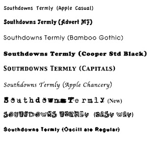
What Fonts Do You Want To Use? 
I used Microsoft Word on the Mac and tried out a different range of font styles with my title. Some of them were not chosen because they where hard to read, or did not match the target audience of students. I will also chose to have the font green because it is a neutural colour and it will be suitable for both boys and girls, also it is the theme of the magazine and the College colours.


The text I have chosen to use after given various feedback is 'Easy Way' because it is fun. This is the final outcome of the font:


What Are Your Ideas For Taglines?

My Tagline will be 'The Essential Student Guide' Because it shows how important the magazine is and emplies that it will be useful to students, making them want to read it.

When In The Year Will It Be Published?

I will do my magazine Christmas themed because it will be an easy theme to work with. 

Task 5: Skills Audit

About Bluetoothing Files: 


Beginers Guide To InDesign